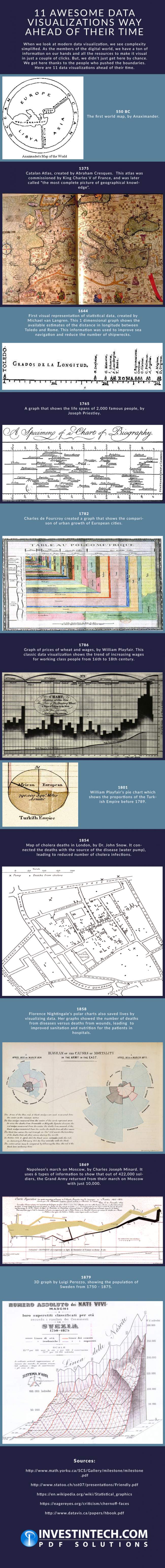
Believe it or not, the history of data visualization dates back to over 500 years before Christ. Visual representation of statistical and other types of data, as well as geographical maps, rendered itself highly useful to humanity, not just data analysts, statisticians and professionals in related fields. This infographic takes you on a journey through the centuries-long history of graphical data representation and looks at 11 charts, graphs and maps that were far ahead of their time. Modern day explorers and travel addicts who rely on online maps should take a peek at the first map of the world created by Anaximander, or the Catalan Atlas which dates back to 1375. You will learn that the atlas was commissioned by the king of France, which speaks a bit of how important geographical knowledge was to rulers.
History buffs may enjoy the William Playfair’s pie chart created at the start of the 19th century which shows the proportions of the Turkish Empire before 1789. There is also a graph representing Napoleon’s march on Moscow that visualizes enormous losses of people’s lives during the campaign.
Check out the infographic to find more graphics that were quite revolutionary at the time of their creation.
Infographic Source: http://www.investintech.com/resources/blog/archives/5692-data-visualizations-infographic.html