Infographic is at present a best visual content approach to connect well with the target audiences online. This kind of visual content with enticing storytelling is currently proving regularly as rewarding approach for many online brands. Also, it is a wise approach to share information and data in the effective manner too. Here, visually appealing and engaging infographics creation is definitely not an easy task to achieve too. Let us see 5 best and useful tips in this context in order to come up with a best infographic that can match well to your needs and expectations successfully: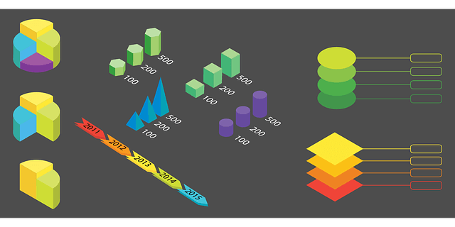
- Infographic is in general a complex approach through integrating images, graphs and text in the best effective presentation approach. It is important here that your infographic should be easy to read and understand for all over the internet. Text in right font style and size is vital integral part of this approach. It is always wise and important to select your textual fonts those are simple and clean. Also, it is good to limit the variations that are planned to use in the creation too. Pay more attention to your font style and size without fail and it can make your creation effective.
- Usage of colors within the infographic is another important aspect that needs special attention from you without fail. Keep a strategy in your design in a way your colors can complement well your textual content and images. Always try to keep contrast for this purpose through using light background for dark font styles and in the vice versa. Also, it is a best practice to avoid the usage of dark backgrounds too as these will dominate your storytelling unnecessarily. Also, limit the colors usage to a certain extent until the whole creation can be pleasant and acceptable by the readers. Always try to keep away from the colors those are making content reading tough and straining the eyes.
- Images in your infographic play an important role in making your creation effective and storytelling enticing. In fact, images will play vital role in establishing effective communication with the readers too. The main concept of the infographic is that images are effective than words and this should be made further more impressive through selecting right images for the task. It is important not to use stock photos and images those are regularly seen online. Select these images or photos those are unique and matching well to your topic and storytelling. It is important to check copyrights aspect without fail while using images or photos from the online.
- Simple and less concept is more effective on your infographic creation. Data presentation in your infographic should be limited to simple extent yet making it easy to understand. Any complex and tedious data representation of data can lead to ignorance from your target readers online.
- It is important to make your infographic creation easy and effective for you. Here, some of the online templates available from the industry pioneers at free of cost can make this easy for you without fail. Predesigned templates are always a quick and effective creation path for your visual content creation needs. Check for these templates and make your work more effective, quick and easy for you.
Scatter Plots Effective Usage on Your Infographics
Scatter Plots are totally different from our regularly used line graph or pie chart or bar graph, but definitely made an impact on data visualization with their specialized presence. These are capable enough to represent your data almost like line graphs, but visually make more difference with their specialty. It uses vertical and horizontal axes for plotting data like the way we does with the line graphs. The only difference you can obtain through it will be through affecting one variable with other. It means the trends and relationship in the data can be visualized with significant effect through it.
Reading scatter plots is definitely not complex as these are purely 2D that is two-dimensional representation of graphs. These are presented with two axes along with data points. One value of the data set will be attributed to each scatter point. Here, every point will be plotted with significant values on each axes. This is the reason, why these are said as two dimensional. There will be correlation as well as relationship between 2 variables. For example, data points being closer like almost in the form of straight line signifies stronger relationship. Similarly, it is important to read these scatter plots basing up on their direction, strength and slope.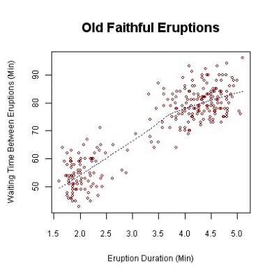
- The slope started for scatter points from bottom left and going to end at upper right is an indication of positive correlation. It means both values are together at the increasing approach. Here, data points will always lie directly in the format of best fit line.
- If the slope started on upper left for the scattered plots and seen ending at the bottom right is an indication of the negative correlation. Here, one value is increasing while other is decreasing.
- Sometimes, these scattered points tend to show no correlation at all between data points. This kind of situation with no correlation is termed zero that is Null.
- Correlation strength in the scattered plots often decided based up on few factors. Here, number value attributed to the correlation will play a vital role in deciding its strength. If this closer number is seen as 1 or the -1, then it is called as stronger correlation. If this number is 0, then it is obviously weaker correlation.
Vector Elements for Infographic Effective Design
While infographics taken front seat in the content development needs, vector elements are seen being prominent in this visual content creation procedure. Complex information that was explained earlier through text is now replaced with graphic elements in this visual content and this is currently proven as an effective manner of content creation for the present day netizens too. Here, the visual elements used in the infographic are in different types like signs, charts, arrows, diagrams, maps, statistic elements and many more. Altogether, your infographic is turning into a more telling effect enriched visual story for your readers.
The basic back bone and important factor of your effective infographic design at present is definitely vector elements and vector graphics. These are available in the free format online from the best reliable sources too. Just check for free downloadable vector elements online and you will see plenty of them those are more helpful for your visual content creation needs. Mainly, this vector graphic is all about an image that is made of vectors like strokes or paths. Here, vectors are control points to lead towards a specific point or destination. These vectors will serve as a best background for your visual presentation and these vector elements are nowadays used in the web design too.
Infographic design and creation is nowadays very easy and simple through using free online templates, vector graphics and vector elements. Here, you have to select them based on your topic and story. Right selection can complement well your story telling in a way the reader can be satisfied more with your visual content online. It is time now to move forward with the latest trends in the content marketing field and infographics are leading this path to a great extent all over the world. Never take back from this visual content creation while online tools and features are making it easy for you. It is always good and safe to check popular infographics here in order to come up with a best topic and storytelling for your content requirement. Rest of the action will be definitely taken care by the available templates, tools, graphics and images.
Maps are in general a great help to understand the world all around us. Now, these maps of various forms are used significantly well in the infographics too. Maps are definitely a great help in visual story telling through specifying in detail about a particular geographic location and connected period of time. Complicated data sets are very often simplified in visual content using these maps. Maps are definitely a best data visualization tool now with their simplicity and ability to add depth to the presentation. Very often these map additions making the visual content engaging and connecting well with the audiences too.
Types of maps and Their Effective usage in Infographics
Maps are effective help to visualize well your geographic data. At the same time, it is not good to use it because your data is suitable or mapping. The story telling and topic should demand the necessity of the map otherwise the whole plot can be spoiled unnecessarily. For example, you have geographic data that needs to be analyzed in your presentation, and then graphs and charts are the best choice. Similarly, you have data that needs to be presented with the locations as the major highlight along with patterns and proportions, and then map is definitely a good option here. 
Map Types for Your Infographics
- Choropleth Map: This is a type of map that will help you to display divided geographic areas with colors are shading. It is a best representation on maps for a particular geographic location such as density of population, economic diversity, ownership of land and some more.
- Isarithmic or Isopleth map: This type of mapping is also called as contour map too. This type is a great help to depict continuous phenomenon like temperature, precipitation and some more. In this map, each geographic region is presented with a value in the 2D or 3d format representation.
- Cartogram Maps: This is a best match for presenting thematic variable like population and travel time and some more as similar in nature like distance, land area, etc.
- Flow and Connection Maps: It is a best map representation to indicate movement of the people or goods or any other. These are very commonly used to present migration patterns, airline transportation, shipping routes and some more.
- Bubble Maps: This is a mapping presentation to signify proportions comparisons with multiple geographic locations. Here, symbols with varying size used to present data. For examples, circles of varying size at various geographic regions will signify the associated data to those particular locations.
- Dot Map: It is used to signify presence of a particular feature at the various geographic locations. These are perfect to display spatial pattern. For example, Company A got branches all over the world and the same will be presented with dot points at the various geographic locations on map where there is a branch for the company A.
Poster Templates for Infographic Effective Creation
Are you planning to create a best infographic for your content needs? Then you should be aware of many things those are connected well with this kind of content creation. Here, poster templates are your best friends for sure. These are available online from the experts in the free and paid versions. My suggestion is to try initially few freely available templates and tools online. This will help you to understand well about the templates, tools and their effective usage. Down the line, making good use of the paid templates will develop your skills in the visual content creation to the maximum extent. Most of these templates and poster templates come with the best customizable featured intertwined well in each one.
Poster templates are currently working well for the needs of infographic creation for events. This will allow you to present your event details quickly and easily besides keeping your storytelling interesting and minimalistic too. Event posters designed through these templates will result into more professional approach for all. At the same time, these can help as print material as well as online shareable opportunity for your event spreading needs too.
It is pretty common for many of us to get jitters, whenever started creating an infographic. Here, everyone should know that you need not have to be a graphic specialist to create it well. Nowadays, there are many online experts offering tools and templates to make the task easily accomplishable for all. Just try once on your own on this visual content requirement using online freely available tools and templates. It will start to make you a real professional in this field. Initially, start to explore all the available tools and templates in detail. This will let you have reasonable command on them. This kind of acquired command on own can transform you into a best visual content developer down the line.
Plan things little advance for your visual content creation needs. Collect and gather correct and relevant data for your infographic too. Now, start using the same data through infographic tools and templates those area available with the best customizable features. This will turn your task easy for you within no time. This is the best way to make your own visual content while customizable templates are standing as good help and support for you.