One of the most important steps in creating a data visualization or dashboard is selecting the best chart type for your data. Only certain chart types are appropriate for conveying your message, but it can be hard to figure out all of your options. That’s why the iDashboards team but together this handy infographic to break down chart types based on how you want to present your information. Whether you are trying to show the distribution, relationship, composition, or comparison of data… this infographic can lead you to the most appropriate chart option.
Let this infographic guide you through all of the chart types and categories you could want to use in your dashboard. Think of it as a cheat sheet for setting the stage for your data story!
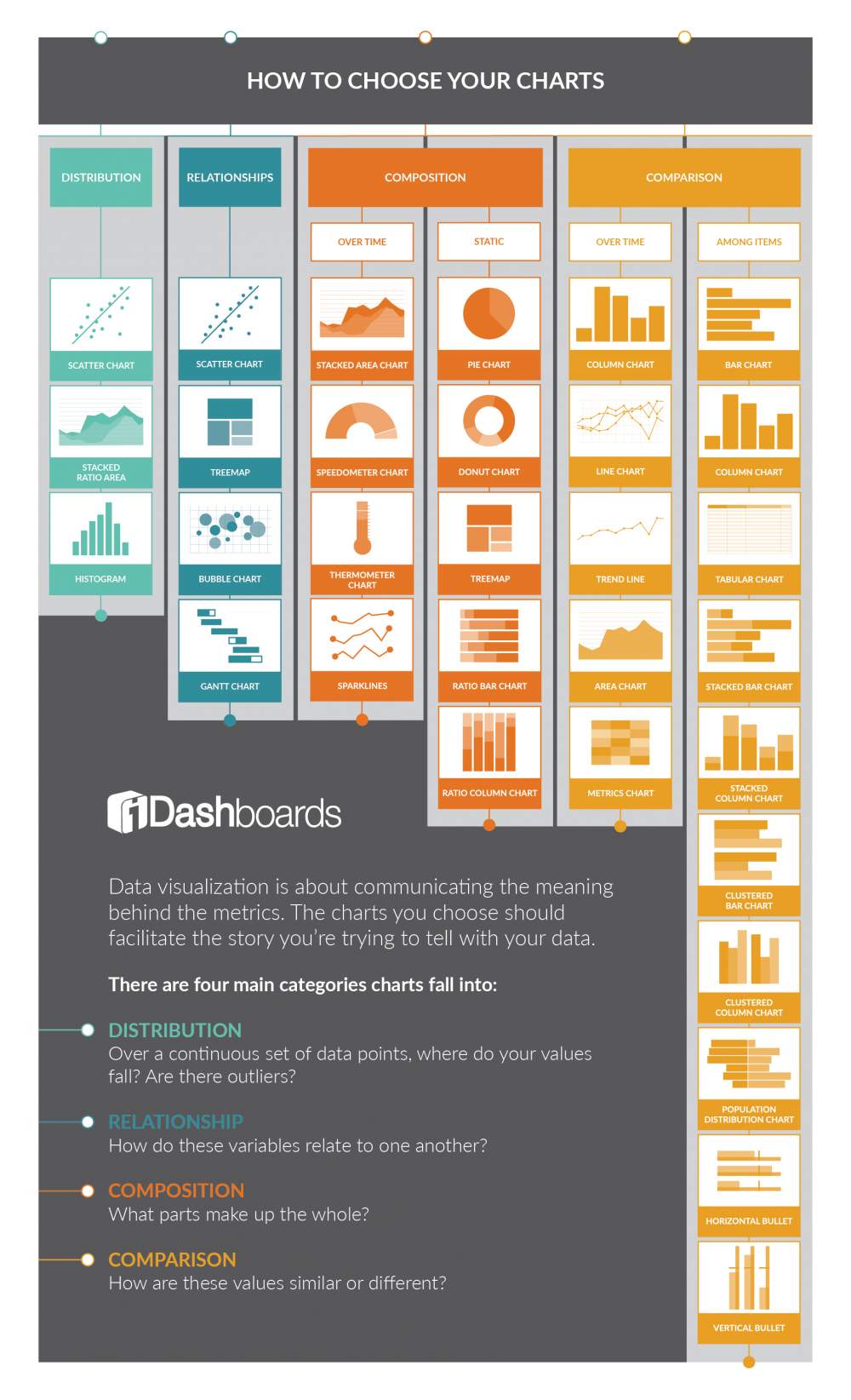
Infographic Source: https://www.idashboards.com/blog/2018/12/10/infographic-how-to-choose-your-charts/
How to Choose the right Charts
December 14, 2018
A dedicated full-time digital marketer with 12+ years of experience in the industry. Since 2015, he has been successfully running infographicportal.com, a platform that showcases high-quality infographics across various topics. Nagendra's expertise lies in creating and executing effective digital marketing strategies that drive engagement and growth. His passion for visual storytelling and commitment to excellence has made him a respected figure in the digital marketing community.