Every infographic design main aim is to reach well the target audience and to meet their expectations. Here, some of the solid practices added with the best tips and solutions can make your aim quite achievable. You should implement these best practices and tips without fail while designing your visual content. Let us see some of those best practices and tips in detail below:
- Understand Well Your Design: Design choices for your every visual content in general are style, illustration colors and intertwined driving force in the story telling. These choices should be made purely basin g up on your client’s interests and their target audiences’ expectations addressing. It is quite imperative to match well your choices with the mentioned without fail in your design.
- Spacing: It is highly important that your design should have consistent spacing in it. Baselines and grids in your design play a vital role in a way to present well each component of your visual content in soothing way to the eye of the reader. It is important to align well all your design elements in a way the entire visual content can take best appeal successfully.
- Hierarchy: Hierarchy is another important part of your visual content design. It is definitely not a good idea to use too many types of fonts and different sizes. Always restrict your font style interest up to two font families. Use the font size basing upon the story telling hierarchy. This will keep your design soothing and appealing.
- Data Visualization: Data visualization in the infographic is always an important element. It is important to gather valid and right data for your infographic and present it in suitable data visualization format without fail.
- Colors: It is important for you to forget about your favorite colors while designing infographic, Choose colors those can be of the best interest for your client and client’s target audience. Use suitable background colors in a way the text can be readable flawless. Colors and their selection is definitely another important part of the visual content effective design.
All the above mentioned tips can help you to create a best and appealing visual content and the next part is making it reachable to your target audience. Here, social channels and popular blog sites are the best place for this purpose. Use these practices and turn your infographic into a huge success.
Choosing Bar Charts for Your Infographics
Bar charts are since very long helping a lot in the infographics creation and these are the best data visualization accessories at present too. Sometimes pie charts may sound as best alternatives for them basing up on the special reasons and purposes, but bar charts always got their charming spot on every infographic. Now, there are multiple types of bar charts available for you to use and these can add up further well to your visual data presentations too. Let us see some of these types:
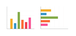
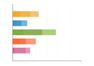
- Vertical Vs Horizontal Bar Charts: These are very well helpful while presenting two different factors of an object. This kind of horizontal to vertical bar charts presentation can work well with comparison needs too.
- Histogram: This is almost similar to line chart to represent continuous categories and their comparison values. Values continuity differences at one particular event or day will be good to represent through this type of bar chart.
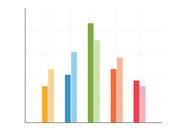
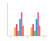
- Grouped: This is a best type of bar chart to present comparison between many groups of categories at once with good telling effect in your visual design.
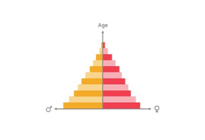
- Population Pyramid: This is a kind of chart that allows presenting details in both directions from the Y-axis. It is like double histogram with possibility to show significant comparison between two entities like men and women or something similar.
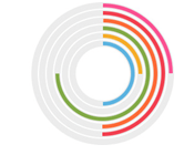
- Radial:This type bar chart uses polar coordinate system and it is definitely little different approach to present values than the monotonous approach. Here, you can ascertain the value of each through its angle rather than its length.
- Stacked:This is a best type of bar chart to present “a-part-to whole “kind of comparisons. This will allow you to present details of different objects with the comparison of the values.
- Progress Bar: This is a best bar chart that needs no explanation about your figures and aim. This is also another good option for the “part-to-whole” approach in your visual presentation needs.
Choosing Area Charts in Infographics
We have many different types of charts to present data in our infographics. These are playing vital role in the effective data visualization needs. Area Charts are one of the specialized statistical charts practices those are used for special cases in the infographics. These are almost similar to line charts, but with slight differences. Here, data changes over the time or overall trend patterns or datasets continuity will be depicted in more effective way, while area charts signifies little difference here with emphasize over space between axis and line being filled indicating the volume. There are few types of area charts available for this purpose and those are:
- Standard Area Charts: Standard area charts display the data with different colors or through shading space below to the line. The main focus in this kind of data presentation is to display in the form of accumulated volume for a period of the time.
- Stacked Area Charts: This stacked area charts are more effective to present data in the form of cumulative total with numbers or percentage over the time. This kind of presentation main focus is to display part to whole relationship. This will signify the data, how the each category contributed well for overall total.
- Stream Area Charts: These are special format of data representation not used widely too. This is a generalization of the stacked chart that is baseline shifted over to the centre. Each individual color height here indicates the value of that particular stream that took changes for a particular period of time. Here, duration will be identified through shape and length.
- Stepped Area Charts: This is a best representation useful to highlight a trend with its increasing and decreasing status for a period of time. This is normally used to present change in the pricing of a particular commodity or an item such as gas, petrol and some more.
Area charts are definitely a great addition to your infographics, but cautious approach is very much essential as wrong practices or usages can result into occlusion. Suitability of a type of chart should be decided with utmost attention. Take for example, there is a necessity to represent percentage or summation, then stacked area charts are the best match here.
Choosing Template for Your Infographic?
When we prepared to create an infographic, template will always be our first requirement. It is very commonly seen by many people using the same template for their different infographics. It is true that you can manage your visual content creation easily using a single template, but you should play differently with your content feed here. May be you’re using a same template, but let it sound unique than routine. If you fail at this aspect, then your regular visitors will find it monotonous.
Content should be used wisely while using the same template again and again. Take the best excerpts from your research those can instantly grab the attention of the reader and replace such content over the older one. This can make it special to a great extent. Create the header blocks and all other content fields with interesting unique content. Similarly, take additional care about visual elements of the template too.
Replace the older icons, maps, and charts with new ones. Do not mess it up with this step. Very often, we tend to select some new icons those are different from old ones, but make this selection based up on the topic otherwise things will go wrong and to an extent worst too.
It is nothing wrong to use the same template for the new infographic through taking few precautions and some more as mentioned above. Also, you can make it further novice the same template for the new infographic through adding new typefaces, new color schemes, changing background color, changing the shape, and some more. This is the reason we cannot identify the difference while experts made new infographic on the old template.
This doesn’t need expertise, but little cautious and attentive approach is something that is essential here. Try this kind of approach while using the old template and this will make your visual content look like a best one with no signs of used old template for the readers. This kind of adaptability is currently making infographics as the best practice and easy too.
Visual Elements & Fonts Hierarchy in Infographic
Design is always an important integral part of the infographic, but it is not alone about making it pretty too. Your visual content should be a best representation of the effective story telling along with more functionality in it. Here, hierarchy is something that can help you well for this story telling with your visual elements as well as text fonts.
Definitely, hierarchy should be part of your infographic design. Present your elements based up on their importance in the total story telling through adding in it effective colors, texture, contrast, position, shape, size and orientation. This kind of approach will ensure visual importance for the user to the maximum extent.
Story telling through infographic is definitely a wise approach at present for the marketers, but adding it with perfect hierarchy is nowadays proving as mandatory too. Visual content shape and size basing up on the importance is one kind of importance besides adding it with right kind of colors and size is another important aspect too. Your hierarchy should send sense of flow for the reader and it should be attained well through selecting right size, shape and colors.
Any slightest mistake in this hierarchy practice can lead to different attention from the user than the desired. It will be same with your text in the infographic too. You should use right font style along with right size and right color too. Sometimes, it may be necessary in some areas of the visual content to dominate visual element through text. There should be proper hierarchy strategy for your text too based on the importance within the story telling and add right and suitable font styles, sizes and colors appropriately.
Any visual content presentation ensured with the right hierarchy will connect at right level with your target audiences. It is important here to come up with right topic and right context and right story telling before to the design. This will give you a right approach to ensure the right hierarchy for visual elements and text fonts successfully. Your best infographic creation will be more rewarding through following this kind of approach.
Use Icons in Multiple Ways in Infographics
Icons are generally seen in the form of illustrative image in the infographics and you can turn your visual content as Infographics Iconic with simple alterations and additions. Icons are also termed as clip art to represent well an object or an idea or an action.
These are currently best stylized designs to make your visual content more impressive and attractive. Importantly, icons are the best approach to turn your infographic into more professional as well as cohesive too. There are above 10.000 different types of icons available to use properly on your designs. Let us see, how best we can transform an infographic through using icons in different ways:
- It is always a good idea to use icon in the place of a title or name. This kind of well chosen image type of icon can express more than a title or name to your readers. Also, it will turn into an effective communication on your design with your readers too. The best example in this context is usage of the favorite sports team logo or icon in the place of its name. This will save space on your design to a great extent.
- Similarly, you can start using an icon in charts and graphs too. Each section of the graph or charts needs presenting its name or title. There, start using the icon instead of name or title. This is another best and simple way to present data to your readers.
- Using icons in the place of bullet points is another impressive way to present your design. This will turn your list more thematic. When you used icons to bullet points of each, it will ensure pictorial association to the context of the each. This will be easier to understand for the reader too.
- You can use an icon as header in your infographic. Here, the real essence is that you either use an icon that is best as header than text or use icon that suits as thematic connection with the context as header.
- Using an icon as background is the latest trendy design here. These icons are always capable enough to turn into a best background to your theme and making it opaque can works well to the situation with not overshadowing the text.
- It is always a good practice to create your own icons that is perfect for your story telling. Make it sure that this new icon design is simple and suits well to the purpose.