With users nowadays more likely to access websites through their mobile phones, the importance of being mobile-friendly and responsive has never been greater. In fact, website owners would do well to begin with mobile in mind when designing and developing site content.
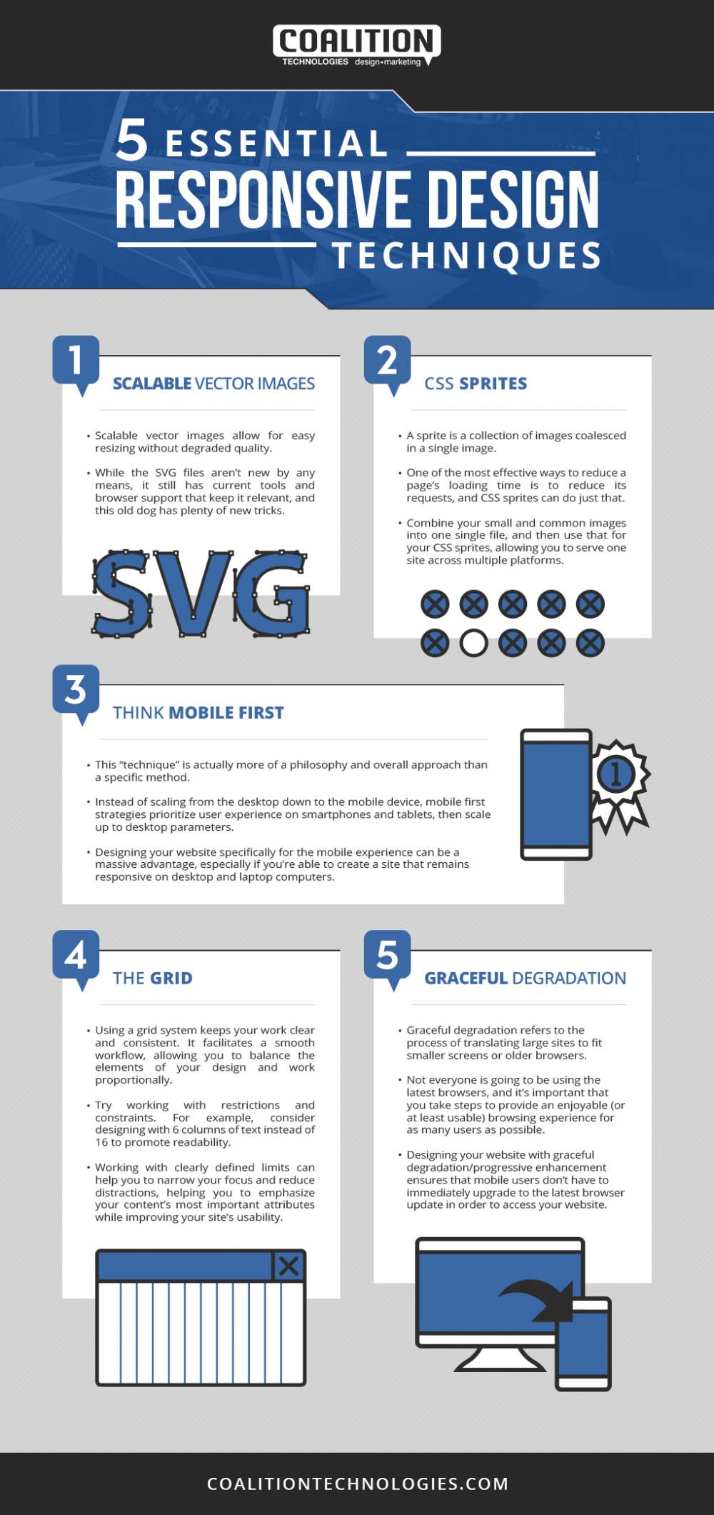
How exactly does one create, design, and develop a site that creates a seamless experience for mobile users? What are the elements that constitute a responsive design? Coalition Technologies, one of the leading US-based digital marketing firms, shares tips on how web designers and developers can ensure that they incorporate mobile-friendliness into their work for clients. The tips include utilizing scalable vector images, reducing page loading time by using CSS sprites, beginning with mobile strategies in mind, taking on a “grid” approach, and keeping graceful degradation in mind. By consistently implementing these measures and using these tips, web designers and developers can create conversion- and mobile-friendly experiences for site visitors.
Infographic Source: https://coalitiontechnologies.com/blog/5-essential-responsive-design-techniques/12881/
5 Essential Responsive Design Techniques
October 13, 2020