Ever since people began using infographics to make dense information easier to digest, designers around the world have been coming up with engaging and awe-inspiring results. But what does it take to create an infographic that’s focused, relevant and effective? Here are a few tips on how to design cohesive infographics.
Come Up With a Sensible Layout
When designing your infographic, make sure the layout is practical. Coming up with a layout that makes sense doesn’t mean it has to be boring, but don’t sacrifice a good layout for an abundance of style. You may find it useful to position your information in such a way so that the reader’s eye naturally travels down the infographic.
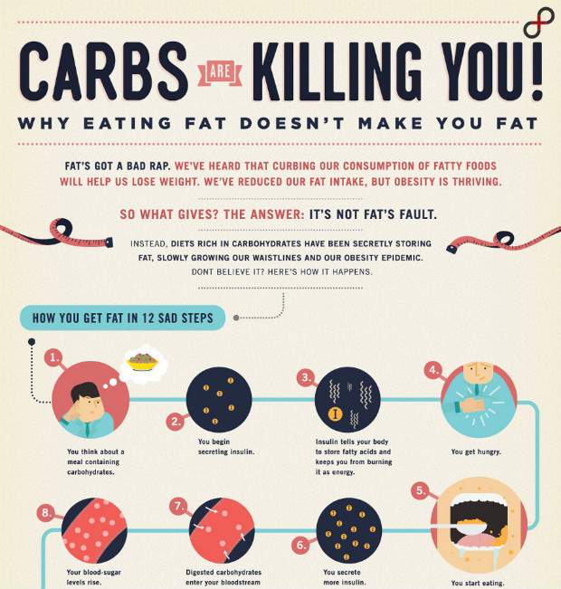
Check out this infographic about the dangers of eating too many carbohydrates. The first portion features several steps that explain what happens after a person consumes them, then other sections are strategically grouped together for easy reading.
Build Your Infographic Around aClearly Identified Topic
Even the most visually stunning infographics won’t be very useful if people aren’t sure what they’ll learn by reading them. When your goal is to create a worthwhile infographic, try to make it so people can tell within the first glance what your infographic discusses and whether it’s something they want to learn about in more detail.
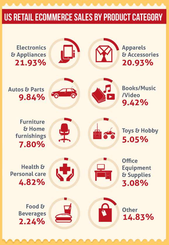
Examine how the infographic below by Invesp does that when explaining stats about the retail industry in the United States. The top of the infographic immediately identifies the topic, and each section relates to each other, so previous information gets built upon as people scroll down. When readers are done looking at the material, they’ll come away feeling as if they have truly learned something.
Stick with an Attractive Color Scheme
The color scheme of your infographic is arguably one of the most important things about it. You can use certain hues to call attention to data or just make the information more enjoyable to read.
The infographic below discusses drug-related pregnancies. It strategically uses a yellow and black color scheme that’s similar to what’s used for traffic signs. Those two colors are already well known for pairing together smoothly. Then, the creator makes a brief departure from the established hues by using a shade of orange for the words “on drugs.” This calls attention to the theme of the infographic without disrupting the color scheme in a negative way.

Don’t Overlook Typography
Initially, typography may seem like a relatively minor part of your overall infographic design. However, the type can bring definition to your content, provide readers with a clue about the type of information to expect and give personality to the finished product. Those are just a few of the reasons why it’s smart to choose your typography carefully.
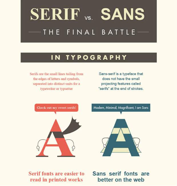
The example here of an infographic with terrific typography probably won’t come as a surprise. That’s because it relates to typography and was specifically made to help people differentiate between Sans and Serif typefaces. Instead of just using words to describe these two common text families, the infographic relies upon Sans and Serif lettering for each of the descriptions, so readers can not just absorb the specifics through reading but also observe the variations.
Understand Your Target Audience
In the effort to get educated about best practices for infographics and try diligently to follow them, some designers unfortunately lose sight of how to best appeal to their target audiences. Look closely at the infographic below that the CDC made to help travelers prevent bug bites.
The infographic presents information in a pleasing way that’s likely to appeal to people who already have their vacations on their minds. If the information were delivered in a more formal manner, there’s a good chance people wouldn’t take the time to read it.

Hopefully you now feel you can get off to a good start when designing your next infographic. With help from the tips and examples you’ve just explored, it should be easier than you first thought to create an infographic that gets noticed for all the right reasons.