In an ideal world, all your online visitors would browse through your site, add items to their shopping carts, complete the checkout process, and happily wait for their purchases to be delivered.
However, as most online entrepreneurs know, the common roadblock of experiencing “shopping cart abandonment” exists — it’s just the reality of life in the e-commerce world.
Baymard Institute says that the average online shopping cart abandonment rate is at 69.89%.
This means that a huge chunk of your visitors might be interested in your products but will leave your site without spending a single dollar.
Should you just sit back and let them walk away?
Fortunately, you have the power to fix the situation. A few tweaks in your checkout process can drastically increase your sales.
In this article, we’ll help you understand the psychology behind shopping cart abandonment and what you can do about it.
Let’s jump right in.
1. Simplify the checkout process.
Most people prefer online shopping because they want quick and convenient transactions.
Why give time-pressed consumers a lengthy checkout process when all they want to do is buy something from you?
Don’t be obsessed with gathering too many details from your customers, especially on your checkout page. Requiring them to fill in numerous fields might just push them away.
Here are specific steps that can help you simplify the checkout process and make the life of your potential customers much easier:
- Allow for a guest checkout option so that users won’t feel pressured to register their details before checkout.
- Design the checkout page in a way that all the information you are asking from users fits in one page. Don’t ask for unnecessary data.
- Provide an option to login on Facebook for checkout. This means a lot less work for consumers.
2. Be transparent with fees and provide a product summary.
Let’s say you were able to lure in a consumer with a good sales promotion. What do you think will happen when he gets surprised with hefty shipping costs during checkout?
He’ll think he was tricked!
Most likely, he will abandon the cart and leave with a negative impression of your brand.
When it comes to money, it’s important to be transparent right from the start. It’s never a good idea to surprise your users with hidden costs.
Provide a product summary on the checkout page so that consumers know EXACTLY how much they need to pay and EXACTLY where their money is going.
Highlight that there are no hidden charges or additional fees to make consumers more confident about making the payment.
While there is absolutely nothing wrong with using sales promotions to get more consumers to buy your product, you have to be crystal clear about how much a product really costs..
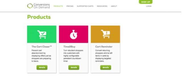
You can try using a tool like Conversions on Demand to help you display your offers more strategically and minimize confusion among your users.

3. Earn the trust of your users with trust seals and social proof.
A lot of consumers are still hesitant to make online purchases because they are uncomfortable with sharing their credit card details and other personal information online.
You need to reassure them that your website meets security standards.
Showcase trust seals from reputable companies to convince your potential customers that their money and personal information are safe with you.
You can also use social proof to ease the mind of worried buyers.
Work on slowly gaining your consumer’s trust by strategically adding reviews and testimonials on different parts of your site, starting with the landing page.
If you do it right, you will have gained the trust of your potential consumers by the time they reach the checkout page. They will no longer worry about giving you their personal information along with their hard-earned money.
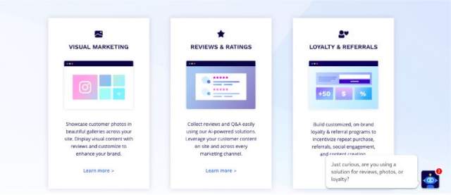
You can use a tool like Yotpo to showcase reviews and ratings more effectively.

4. Minimize distractions and add specific calls to action.
You already worked so hard to get your customers to the final step, don’t complicate things by bombarding them with unnecessary information when checking out.
Avoid adding too many photos or links that will make them open another tab. The fewer distractions, the better.
Add clear, specific, and attractive calls to action so that consumers will know exactly what will happen next. For example, instead of just saying “Proceed” say “Proceed with payment.”
You can fully emphasize your call to action button by maximizing the use of white space, again with minimal distractions. Make sure that your text is large and easy to see.
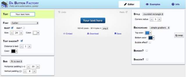
Try experimenting with different button designs to find out which one is most effective and attractive for your site.

5. Offer various payment options
According to Baymard Institute, as much as 8% of customers abandon cart at the payment page when they see that payment methods are limited.
While it’s not necessary to include every payment method available out there, it’s important to give consumers options so that they can choose something that they are comfortable with using.
At the very least, include bank transfers, credit cards, coupons, and an online payment system like PayPal. Analyze what your consumers are using to know what fits your website best.
Again, it all boils down to giving your consumers the easiest and most convenient user experience. The more flexible you are, the better.
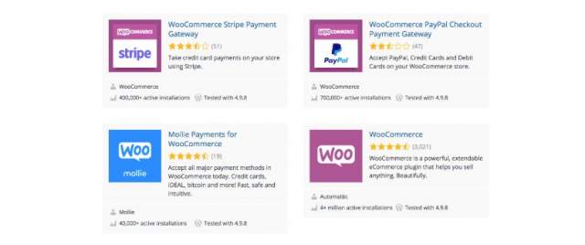
If you are using WordPress, there is no shortage of payment gateway providers who can make your life easier. Installing the right plugins can make the payment process seamless.

Final Thoughts
Streamlining your check out process is an important element of your e-commerce growth. But it is essential to make sure that it works well with other parts of your website.
Check your landing page, product descriptions, photos, and headlines regularly too. It is important to understand how everything falls into place.
As an entrepreneur, it is your job think of the big picture. Always be on the lookout for ways to innovate, optimize and improve the user experience of your site.
What techniques have worked for you? Do let us know!
