Average House Prices In UK Since 1950’s.

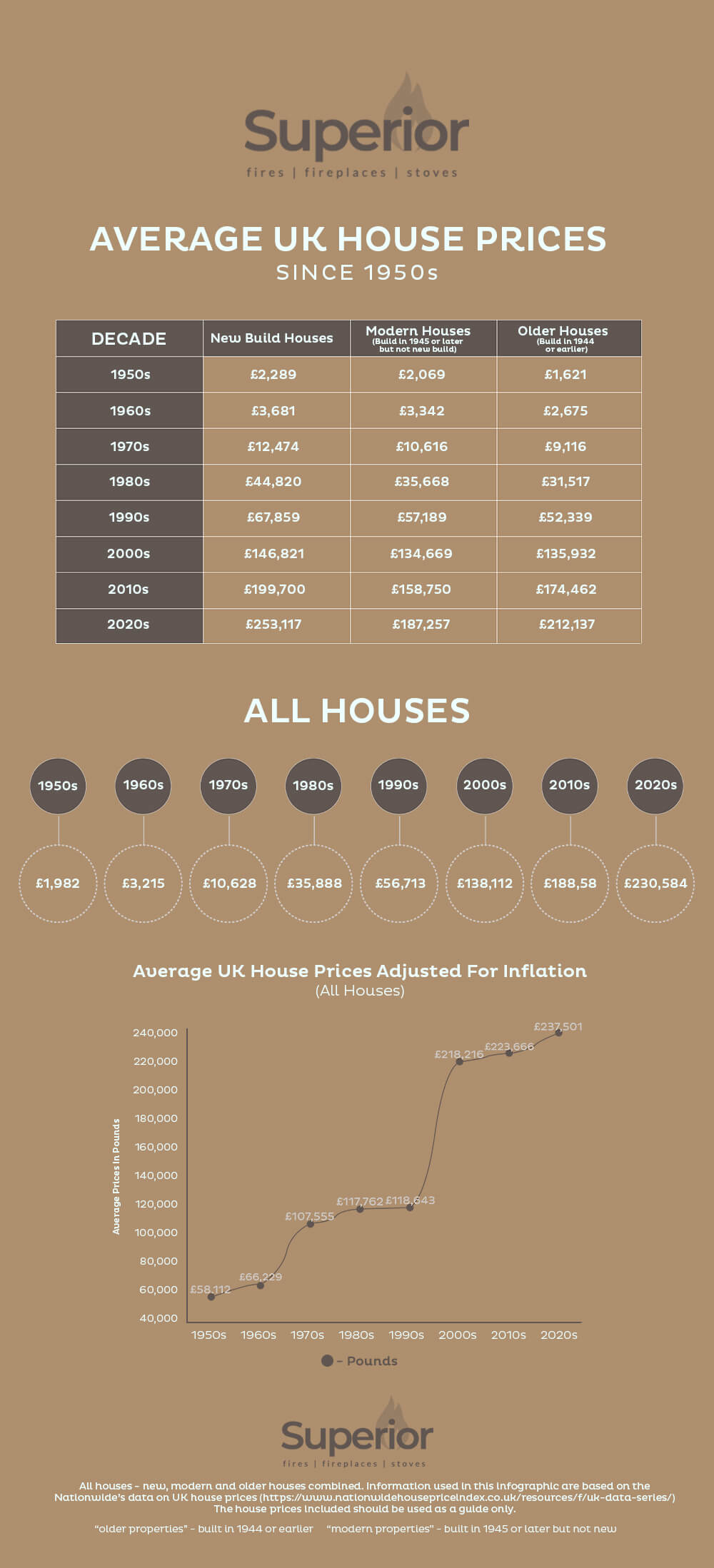
Thinking of buying a property? Not sure when is the best time to get on the property ladder? The easy answer is, as soon as possible. Here is an infographic that illustrates the average house prices in UK since 1950’s.

This handy infographic shows where and when house prices have increased and what the difference is now, compared with each of the past seven decades.

Average-UK-house-prices-since-1950

Infographic Source: https://www.superiorfireplaces.co.uk/average-uk-house-prices/

Liked it?

0

Rate and Share it!

Please feel free to share this infographic in your blogs, websites and social media

SAVE AND SHARE THIS INFOGRAPHIC
User Rating: Be the first one !

Check Also

The-House-Turnover-Checklist

The Essential House Turnover Checklist for New Home Owners

After years of hard work and dedication to saving money for your dream house, the …

Leave a Reply

Your email address will not be published. Required fields are marked *