As we advance into a society that is rich with data and information, our ability to inform citizens is much greater. By interpreting data and trends that are released by public sectors, such as various Department of Transportation websites, we are able to showcase unique data in visual ways.
One prime example is the development of a crash map within the state of Texas, that showcases the areas within central texas (known as the Texas Triangle) that are more prone to experience accidents and roadway disturbances. Since Texas houses nearly 6 percent of the United States populations, crash maps that are developed from data sources such as FARS and Department of Transportation sources are vital for developing resources that inform the general public.
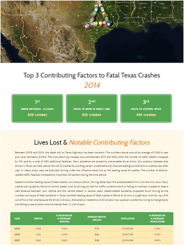
From the data mining, users can visually see that the leading cause of accidents in this area is the influence of alcohol. Secondly, failing to drive in the correct lane, and failure to control speed were the second and third causes of accidents within the Texas Triangle. From the study, we can apply the same results with other nearby cities, and other communities throughout the world. Most of the accidents caused on our roadways are the result of alcohol use, and other distractions like texting and driving.
As data is developed, and recorded each year, statisticians are able to study the numbers and trends associated with the development of the data, and make an analysis on future trends and predictions. Data development is key to the successful development of societies across the globe, and without data, we would have a much more difficult time learning from the trends that took place years earlier.
From the data studied within the Texas Triangle, we can interpret that motorcycle accidents are on the rise within the state of Texas. From 2005, the number of motorcycles that were registered in the state are on the rise, and so are the number of motorcycle fatalities. Again, this information would not be able to be developed without the use of data sets, and having easy access to interpret information contained within our data collections.
Data Visualization – Outlining Dangerous Roadways
September 21, 2016