PJ Harvey’s latest album, The Hope Six Demolition Project, is a sonic shift away from her previous records. I looked at the credits to see if she was working a new group, but instead I saw many of the same names I’d seen for years.
My old music journo brain began to wonder how often she worked with the same people. Then my design brain kicked in and I began to wonder, what that would look like?
I made a spreadsheet of all the albums and filled in who contributed and their role. I included engineers, producers and designers as well as musicians and special guests.
My visual starting point was a circular graph. My plan was to have each circle would represent an album. The smallest circle near the center would represent her debut album and the largest circle would be her latest release. If a person appeared on an album, their slot in the circle would be filled in and their contribution was placed inside.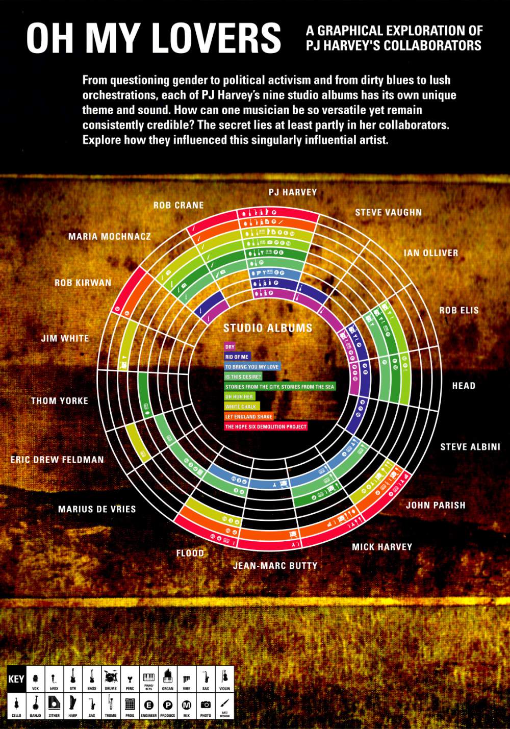
PJ Harvey’s
June 15, 2016