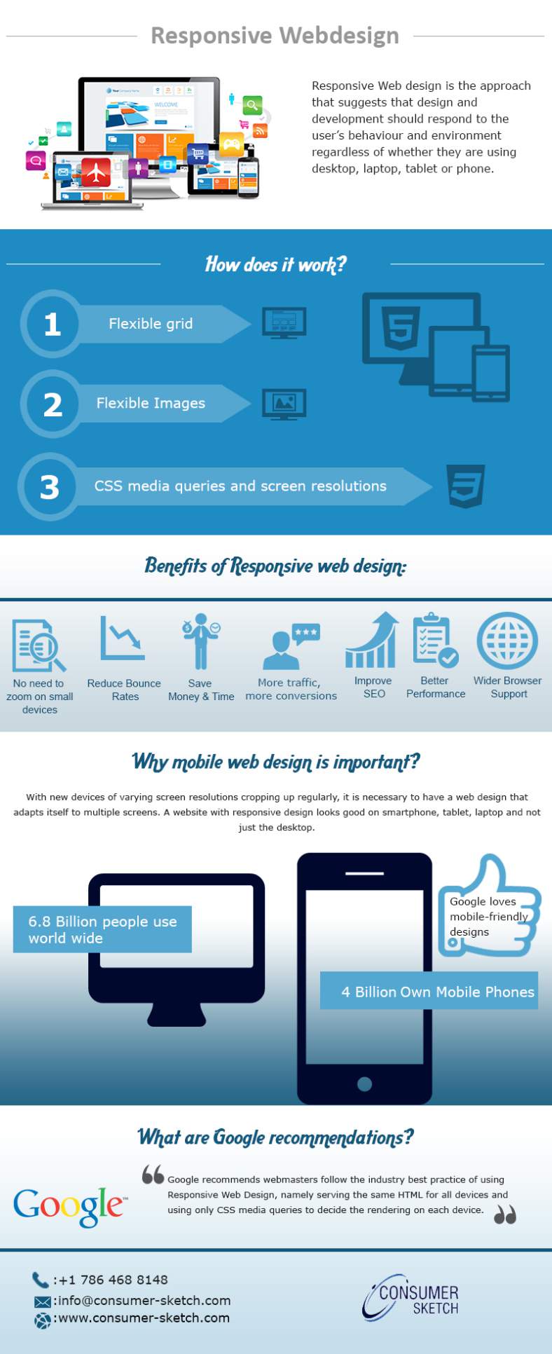
Responsive web design is the progress as per which not only the design but the development is bound to respond to user’s behavior and environment based on the orientation, screen size as well as platform. In other words, responsive web design is up-to-the-minute web design concept which respond exactly to every kind of device that accesses it while presenting appropriate output by adjusting to the required screen size. For the sites that already have a mobile version, it makes sense to go responsive since the need of managing two separate sites will no longer be there.
Our designers work to utilize proven, responsive web design and development methods to help you change your website to meet Google’s recommendations. A three column desktop web design may change to two column design for a tablet and similarly for a smartphone, it may change to just a single column. In a responsive web design, proportion based grids are relied upon to rearrange the content and design tools accordingly.
Infographic Source: https://consumersketchindia.wordpress.com/2015/09/03/responsive-web-design-how-does-it-work/
Responsive Web Design – How Does It Work
September 7, 2015